Arresting Criminal Rolls: A Journey from Outdated to Cutting-Edge Ecommerce

Published on February 7, 2025
When I met Erika in May of 2024 she mentioned she owned a company called "Criminal Rolls." Though I had never heard of it (I mean, I'm a developer so it's not like I get out that much), I quickly found out she had a large following in the Wichita area. Hanging out with her and having multiple people recognize her brand, I realized she was onto something. I went to her website, ready to order some of these famous rolls and...saw there was no way to order other than emailing her. And that is how Erika's entire business opperation ran - you'd email her or send her a message on facebook, wait for her to reply, say what you want, wait to see if she had all the supplies, select a pick up or delivery date, talk about the price...I'll stop there. It was complicated. That's the easiest way to say it. Complicated. Some orders would take days to weeks to finalize. Others fell through. A great business served by bad tech.
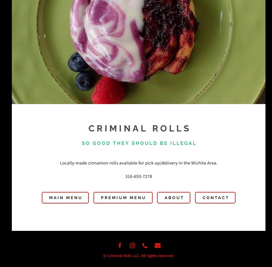
The site itself was good, but seemed a bit dated and also lacked a lot in terms of accessibility with color choices. It was a traditional HTML build so when going from one page to another it would do the typical split-second flash while loading the new html document.

This was the main page. Not a ton of information on the front, which for a e-commerce site for food wouldn't require a ton of information up front. It lists the menu options but you have a "Main Menu" and a "Premium Menu" which can be confusing. Likewise, every week she'd have special rolls that come in 4 pack, 6 packs, and 12 packs (or 10 minis, 20 minis, and 40 minis) and that would change week to week or month to month. The website itself, however, remained static. So there were usually conversation chains of 8-10 messages back and forth with customers on which rolls were available and when they could get them. Being a small business she couldn't keep the inventory in for every single roll, so the email chain with asking for the menu most times.
Lacking an easy way to order is a built-in sales barrier and A LOT of small businesses have them. Often times, it's out of necessity - building an e-commerce site isn't cheap and Criminal Rolls had to grow in business before she could hire a designer and developer (me). But it doesn't change the fact that the more difficult it is to conduct business with you, the less likely people will be to conduct business. Price is one thing, but ease of convenience is another. Walgreens and others found this out lately with their anti-theft approach of locking everything up. They realized through experience what should have been obvious to anyone who has ever done sales - creating a sales barrier is worse than theft and will lose you more money.
Imagine a corner shop at a busy intersection - if the traffic is always flowing and it's difficult to get in and out to buy the merchandise, people simply won't go. We all have those spots in our cities where businesses will open up, thinking they'll be the ones to change that spot, only to close down after a year because of the difficulty of conducting business. What they and city developers never seem to learn is that if there's an inherent sales barrier to your location, you're already starting with a handicap. Multiple websites operate this way, as glorified digital billboards that offer nothing more than "We exist!" That's important, but if you have merchandise (that is, you're not just selling your labor like me, where everything is negotiated) and are a consumer-facing business, having an e-commerce presence is a must. A digital billboard isn't a sales barrier per se, but if you're a business that relies on sales, not having an ecommerce element inherently limits your sales. The site becomes a barrier when it offers nothing more than the statement of, "We're here."
This was the block Erika was running into - the difficulty to do business with her limited her orders. There were missed orders and delayed orders, costing her money every month. But there were other aspects too, such as the color choices on the site.

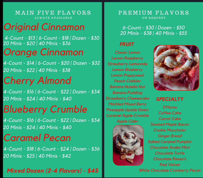
This is the menu that people would need to read to gain information. Arguably the most important page on the site. Yet, the color choices aren't accessible and even for those without any color blindness or visual impairments it can put a strain on the eyes. They remain faithful to the brand colors and color scheme, but sacrifice accessibility in the process.
The background is #26BA8A with a body text of #EFF1EF, providing a contrast of just 2.18:1, meaning even for people without any visual impairments it's still going to cause major eye strain if looked at for too long. #EB150E, the red, is even worse at 1.82:1. For reference, WCAG recommends a minimum ratio of 3:1 for large text and 4.5:1 for regular text just to hit their AA standard (7:1 for normal text and 4.5:1 for large text for AAA), so the most important text on the site failed to hit the AA standard.
In addition, the site was a static site. So it essentially functioned as a digital billboard and nothing more. Erika had no way to change her prices, change her menu, change anything really. She had no access to the files on the site. Just the domain name. And, hey, that's all I really need at the end of the day.
So when Erika came to me with this site, I knew I had quite the project ahead of me. Essentially, I boiled it down to the following:
- The site should operate as a sales funnel - the whole point should be to push the user to make an order
- The design HAD to be accessible in the color contrast while maintaining fidelity to the brand colors.
- The site needed to be more than a billboard or an ordering system, it needed to be something she could introduce to her business to make it impactful. In short, the money she spent on the site needed to be an investment with an ROI of just 1-2 years. The site had to pay for itself.
- Update the marketing to give Criminal Rolls a brand persona that would flow throughout the site.
- Erika needed to be able to update the site, update pricing, and have access to critical business functions...all from her phone.
With that in mind, I set out to put together the site. I met with Erika, got to know her business more, figured out her personality, and realized this site could either be easy or it could be complicated. Being me and not someone who thinks through the consequences of my actions, I chose complicated!
The first design wasn't great, wasn't terrible.

The images are placeholders and meant to be bad looking but the overall design still didn't stick out to me. I began to think of it as a customer - cool menu, that's a lot of information, that's a lot to read, information overload, I'm out. By the time they got to a point where they could place an order, they'd already done too much reading. In other words, while I was removing the sales block by creating an ordering system, I was creating a difficulty block within my design that put one more step between them and ordering. Additionally, her menu was going to change from week-to-week, so listing the entire menu up front didn't make sense. To simplify the ordering process, I had to redesign it to remove the steps.
One thing I asked myself is this - why does an online site need a written menu? It's not like you're going to go up to the counter and order it. You're at home and she doesn't have a physical location. So why not do away with the written menu all-together? In fact, why not rearrange this in a way that fits her current business model?


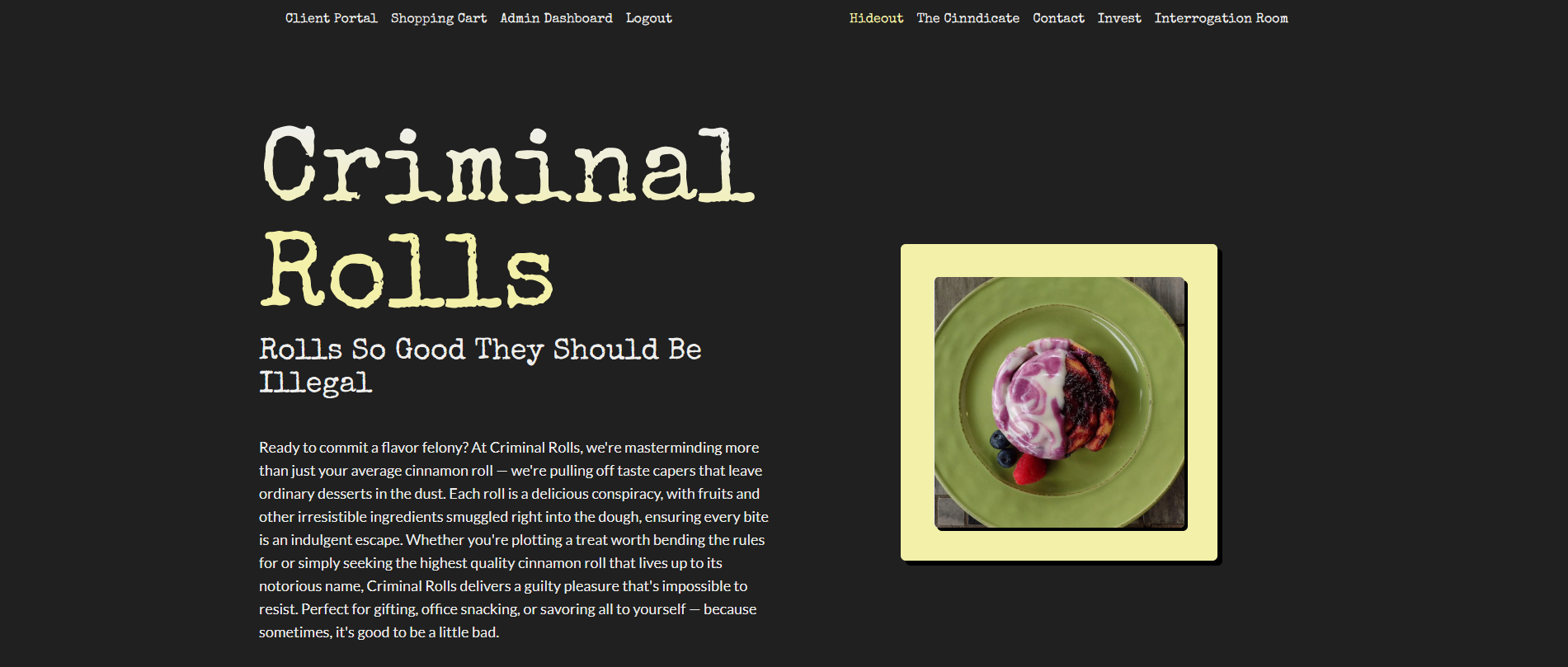
For those not familiar with the brand they can read the paragraph to get a summary. It's a successful hero section that basically gives the "elevator pitch" for the company to the customer. And then they're immediately at the ordering section. In other words, there are no steps between going to the site and ordering. You go to the site and the menu is there and an order is three clicks away (pick the roll, pick the delivery, and pay).
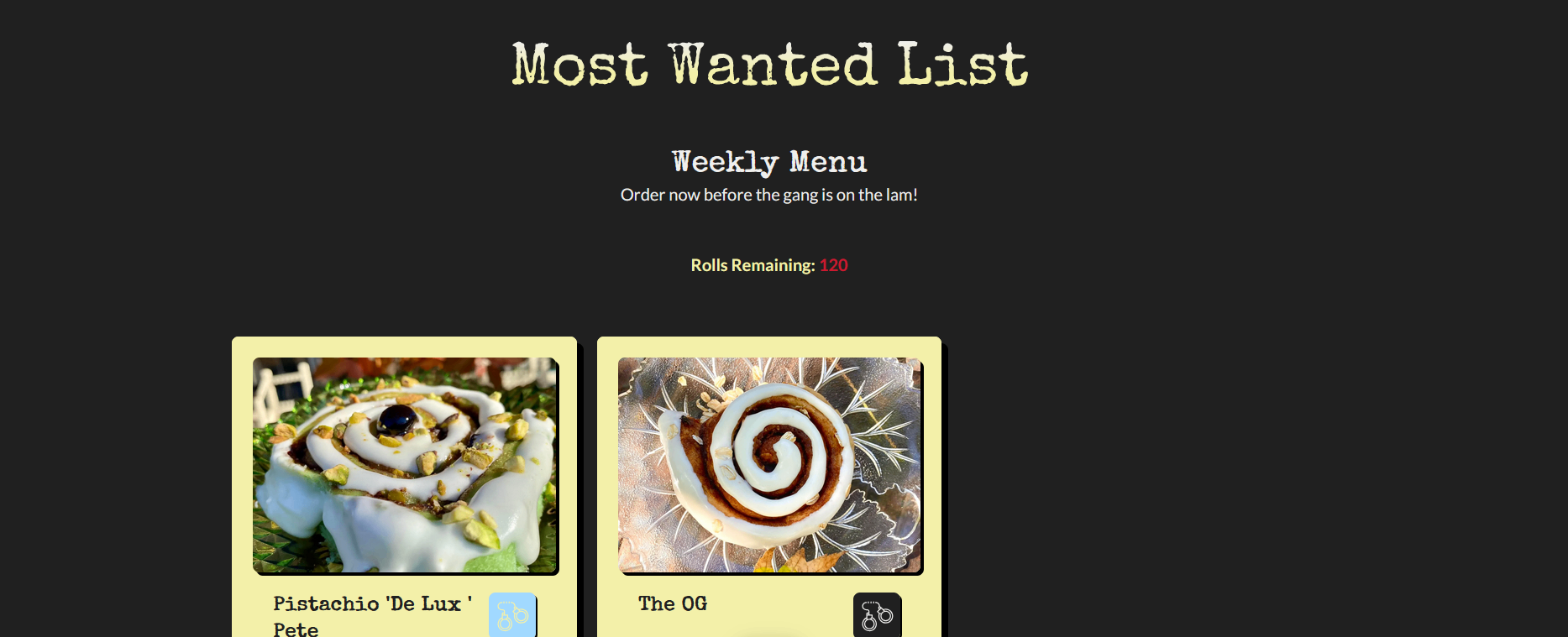
The added feature, however, is the roll counter at the top. Due to the small business nature of Criminal Rolls, they have a limited number of rolls they can make each week. So it's pre-selected at the beginning of the week and begins a countdown everytime someone adds a roll to the cart. So not only is it easy to order, it's easy to see other people ordering and therefore trigger the FOMO (fear of missing out) response. This both helps the business design as it currently sits, but also adds more pressure in the sales funnel. Someone seeing the number of rolls dropping is more likely to make an impule purchase than someone who thinks they can just come back later and try them again. Limiting the supply and making the consumer aware of the limited supply is a great way to create internal pressure and anxiety, which induce impulse buys. And cinnamon rolls, especially of this size, are a delicacy and therefore almost always impulse buys.
While this seems deceptive, the reality is this is how almost all sales and marketing are done. The irony is we live in a time of abundance, yet we've spent so much time in scarcity as a species that the fear is baked into us. In Criminal Rolls' case, they actually do have a limited supply. The supply is scarce. Letting the customer know that up front sets the expectation that if they don't buy today, it may not be here tomorrow. So on one hand while it seems manipulative, the reality is it's inevitable due to the business model. That being honest and letting the customer know how much is left comes with a side benefit that will increase sales is an accident of evolution.
So I acheived the first goal of removing the sales block barriers not only within the first website, but within my own design. The second goal of accessibility was a bit more difficult. The original red is simply too dark for a dark background, leaving a contrast of 2.88:1. So I lightened the red to remain faithful to it, but add more light and brought it up to a 7.01:1 ratio, just barely cutting it into the AAA rating. The yellow and turquoise, as well as the body text, all were above the AAA rating.
This matters because aproximately 8% of the world's population has some type of color blindness, and if your color ratios are off it could limit their ability to read the text. In her market, that's aproximately 40,000 people - in a small city, excluding 40,000 people from your business limits you. There's also the reality that 8% are diagnosed with some type of color blindness, but it's likely that the number is larger as all things exist within a spectrum - when you get people who struggle with color blindness but not enough to get checked or recorded, that number inflates. Even for people without any color blindness, low contrast creates an immediate difficulty in reading and parsing and can cause eye strain. Point being, by not focusing on color accessibility, the original site was limiting Erika's target audience by a minimum of 8%, possibly more.
With the color contrast set, I then looked for which fonts to use. Google Fonts' "Special Elite" served perfect both for a display font and header font. It has readability built-in, but is styled in a "criminal" fashion, similar to a Hollywood wanted poster. For the body font I went with Lato for it's crisp sans-serif and readability. Both fit the persona of Criminal Rolls, which is that Erika is the criminal mastermind and the rolls are all a part of her gang.
Once the site was designed I opted to build it in Next.js using Typescript and TailwindCSS. For the backend I decided to rely on Firebase. I chose Firebase thinking the build wouldn't be all that complex. In retrospect, I should have gone with SQL and almost certainly will be moving some server data to a SQL server in the future. However, because it's a small business and there needs to be room to scale and change and adapt, I stayed with Firebase for now until there's a better idea of how the company will grow and evolve.
Utilizing Next.js and Firebase is a pretty simple task, and the Next framework is built for a project like this. In no small order, I needed a site:
- With a complete ordering system
- A way to add products with full CRUD capability
- An inventory system to track inventory
- A messaging system for her clients to message her
- A way to set up deliveries and pick ups
- A recipe management system so she had a spot for all her recipes
- A beautifully designed site that hit all the marketing and SEO guidelines
Suffice it to say, the project that I thought would be simple ended up being rather complicated. But it was worth it. The price I quoted Erika was around the same price she had been quoted by other developers, but none of them were offering the value that I offered. Likewise, they would have required a switch in her card vendor, or at least added another, more expensive one. Building a customer-facing site that is 90% static shouldn't cost thousands of dollars; you can use a basic site builder and get something of essentially the same quality. If you're going to shell out money for a site, you should get a site, something that actually serves your business needs and is an investment that earns you money back.
And that's exactly the mentality I brought into this with Erika.
The customer-facing side of the site was admittedly easy. Building it out was simple, adding a few components that then decorate the entire site. It took me about a day or two of development time to get the customer-facing side of the site down. The advantage of Tailwind is you can get your site up and designed relatively quickly. While I love SCSS, with Tailwind there's no taking the time to sit there and figure out class names, remembering what the class names were, worrying about specification, etc. While I still feel Tailwind is a bit limiting for highly custom designs, it worked for Criminal Rolls. After all, it's a minimalist style with neo-brutalist elements, so outside of needing to customize the box shadow, Tailwind was ready for me out of the box.
The splash page has the introductory hero section with a link to either place an order or see in town where her product is located. If you click on the place an order you're taken to the weekly specials, where you can subscribe to the category and recieve a text when the specials are updated or you can subscribe/like an individual roll. To order you click on the roll info, click on place an order, decide how many you want to add to the cart, and boom, you're done. No barriers and a simple process that takes seconds to order instead of days and a lot of emails.
Other elements on the splash page are the reviews as a way to establish local credibility. While she is a local celebrity of sorts already, for some (like me) who've never heard of her before, it's nice to see reviews from actual customers. There's also a spot for her wholesale locations, with three different categories. All of them include a link as the linkback for SEO is part of her sales strategy in acquiring wholesale clients.
Finally, there's a spot for investors. Why? Because she wants investors. While she doesn't need them, an investor would act like a steroid injection into her business, allowing her to expierence years of growth in just a few months. It'd allow quite a bit and was a request from the client, therefore it was added.
I haven't included a lot of images because you can check the site out for yourself. I want you to, and if you're in the Wichita area place an order (assuming she's not out)!
Now let's focus on the admin and order system. The reason is the two are tied together.
The admin menu was the most challenging aspect of the build. Admin panels are challenging to begin with - you're pulling in a lot of data, adding a lot of CRUD capabilities, and there's a lot going on. Designing an admin menu? Not so much. It's pretty straight forward - create an Excel-like thing, you can modernize it all you want, it's still an Excel-like thing, and then use it. Easy-peasy. Except in this case, Erika does 100% of her business from her phone or a tablet. She's a one-woman operation, so she needs to have access to the admin panel whevever she is. That makes a robust admin panel that tracks orders, products, inventory, and site settings rather complex to fit onto a phone.
But I did it. Forgoing a traditional menu, I instead opted to go with a unique approach - create a bunch of modal buttons. .png?alt=media&token=2ae57cca-15c2-4301-bff9-c48851edac32)
Using flex-wrap, the menu options are categorized and then represented by modal buttons. All site functionality is handled via these modals. The advantage is that rather than having to click on a link to go back, she can click outside the modal or the X at the top right and she's right back at the admin page with all the functionality she needs.
You can imagine how using a tablet or a phone, even if these linked to different pages for functionality, it'd be easy to get lost in the site. The whole point is to make this as easy as possible for Erika. Being able to click on a button, add whatever you need to add, and cilck out makes this a mobile-first admin panel.
The admin panel has the ususal functionality you'd expect in an ecommerce site. She can view users, search them, edit them, block them (hey, you never know!), or even create a user. She's able to track all orders and mark them on their stage in the ordering process, can review old orders, or can create orders. Her order creation menu was customized for her so that she can create a customized price or follow her regular prices.
The big thing are the server functions. The most important one is the one that notifies Erika when an order arrives. As you can imagine, Facebook Messenger isn't the best tool to rely on when you're running a business. She would miss messages or people would email her and it'd get sent to junk mail. Under the order system I created for her, whenever an order is placed it texts her to let her know. This way, she'll never miss another order again.
Other server functions are anything related to payments, user information, account creation, etc. Basically, any business logic related to or even revolving around privacy and payment security all happens on the server. There is no frontend business logic for any of that, mostly to prevent spoofing, spamming, and other illicit activities.
There's still quite a bit to add. The final product is a few months off, but the launchable product is almost ready to go. As of February 2025, it was in beta testing for orders and I'm gaining feedback. Maybe I'll come back to this and update it later with what I found out in beta testing. But for now, the site is opperational and on its way to being launched!